Triangle/Ternary plots are a good way of displaying the relative positioning of points across three variables. This can be used to cluster and classify points based on these three variables. After the break I have outlined a way of creating an interactive version of a triangle/ternary plot in Tableau.
Here is an example of a triangle/ternary plot on the performance of collegiate players at the 2017 NFL combine across three variables: size (BMI), speed (40 time) and strength (bench press).
Here is an example of a triangle/ternary plot on the performance of collegiate players at the 2017 NFL combine across three variables: size (BMI), speed (40 time) and strength (bench press).
hot to make it using R & Tableau
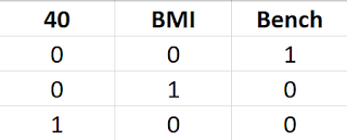
To create this using R and Tableau is relatively easy. First, you need a file with just three variables scaled appropriately. For example, in the above chart, a high 40 time is not good or representative of high speed. So I normalized all of the variables using min-max normalization:
I then save this as a csv file. I import these variables into R in order to create the triangle/ternary plot. Here is the R script below:
install.packages("ade4")

library(ade4)

tri_data <- read.csv('C:\\Users\\name\\Documents\\2017_Combine4.csv')

x <-triangle.plot(tri_data, label = as.character(1:nrow(ta)))

write.csv(x, 'C:\\Users\\name\\Documents\\2017_Combine_Tri_w_anchors.csv')
This will create X and Y coordinates associated with each point (player). I append this to my player data set and bring this into Tableau. To create the triangle plot in Tableau I place the X coordinates in the column shelf and the Y coordinates in the row shelf and convert the measures to continuous dimensions.
Finally, I add a triangle as a background image, fix the X and Y axes, and then remove anchor points (in the corners). I also do some formatting removing the gridlines, adding color, and increasing the transparency.
hot to make using it just Tableau
The talented Mike Cisneros (@mikevizneros) recommended an approach that skipped the R step and allows you to create this entirely in Tableau. Here is link to Mke's version on Tableau Public. It only requires two simple calcs and is much more clever than mine.
Essentially, Mike imported the same data, normalized in Tableau, and then created the X and Y coordinates in Tableau rather than R. In the below Benchn, Bmin and 40n are the normalized measure values for Strength/Bench, Size/BMI, and Speed/40 Time respectively. Here are Mike's calcs in Tableau:
See details on these calculations here on Wikipedia. You again place the X and Y values into the column and row shelves respectively and repeat the other steps above.
You can download my Tableau Public file above. It has both versions (R and Tableau) included. I hope this is helpful. If you have questions please leave them in the comments box below. Thank you.
Essentially, Mike imported the same data, normalized in Tableau, and then created the X and Y coordinates in Tableau rather than R. In the below Benchn, Bmin and 40n are the normalized measure values for Strength/Bench, Size/BMI, and Speed/40 Time respectively. Here are Mike's calcs in Tableau:
You can download my Tableau Public file above. It has both versions (R and Tableau) included. I hope this is helpful. If you have questions please leave them in the comments box below. Thank you.


